Municipal Profile
- Welcome to Kirkland
- Kirkland at a glance
- Major Development Projects
- Municipal Council
- Advisory Committees
- Services to suppliers
- Financial Profile
- Municipal Departments
Coat of arms and logo
Kirkland’s visual identity
 |
Official LogoThe Town of Kirkland’s logo used to identify the municipality is its official signature. Easy to recognize and distinctive, the logo is contemporary of the Kirkland of today. Designed by Tom Pedricks, the Kirkland logo evokes both a tree and a maple leaf. It also incorporates several elements, the colours of which symbolize the environment: green for the foliage, blue for the water and white for the air. The letter K illustrated in green as part of the three Vs stands for Kirkland and their six points represent the six municipal electoral districts at the time. The central pillar symbolizes the Town Hall’s atrium that is the community’s meeting point, where strength lies in numbers. |
|
|
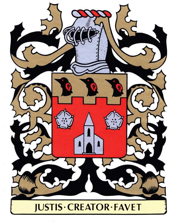
Coat of armsIn the late 1960s, the municipal council adopted a new coat of arms which became the visual identity of the town. It had been the coat of arms of Dr. Charles A. Kirkland. This was designed by the Canadian Heraldic Authority and presented to the doctor by the Ville Saint-Pierre administration where he was Mayor at the time.
|
 |
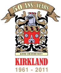
50th Anniversary logoThe choice of the municipality’s coat of arms — The Kirkland family crest — as a visual identity for the town’s 50th anniversary celebrations demonstrates the importance the town attaches to its origins. |
 |
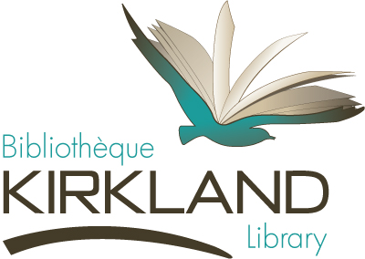
Kirkland Library LogoSince October 2010, the new logo for the Kirkland Library is a bird in flight. Modern and colourful, this bird has an open book between its wide-spread wings evoking themes of openness, free spirit and imagination. This literary flight, the library itself in fact, reflects not only the essential tools for self-fulfillment, but also the discovery of arts and culture. The library is a tool that guides patrons through books into taking flight in many forms. This could translate into learning the alphabet, becoming a better person or being carried away to a different world through literature. |


